‘Seeing is believing’ was the title for this new brief on Post production. When handed this brief I was worried about the skills that I did not have in the software Photoshop. Unfortunately I had never needed to use this software before so this was a huge challenge for me to create an entire brief on something I was not at all familiarised with.
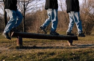
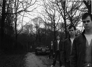
When first developing ideas for this brief my initial idea was to produce some form of campaign poster, mainly on anti smoking, abuse, drink driving, obesity etc. I collected a number of advertisements that related to these topics, mainly using ones that used post production in a huge way. However it was decided when going to my first tutorial that the work I was researching was beyond my ability and that these images were too extreme for me to produce anything that compared to them. So when it came to the task that was handed to the group half way through the brief I was able to produce an image that would allow me to enhance further to produce a final set of images. This picture produced in the task included an image in a woodland area and simply using Photoshop I included a number of images of myself within it, all of which being the same image but changed in size. My main challenge was to make the images I produced for my final to appear realistic, as the images used in this first task was unmotivated, simple, flat and unreal; it was not at all appealing to a viewer. So with this idea in mind I began producing ideas of where these pictures can be taken, and who of. In the end my thoughts were to just use me as the model as I felt it could be more meaningful to have me in places that I found comfortable. Overall I decided that all the pictures would be taken in my home, so I could create my own kind of household with my own characters all of which being me but possibly with different personalities being put across to the viewer. I wanted the characters to interact with each other and not just simply appear that there alone as this may make audience uninterested and not believe that this could be real.
My main thought throughout this brief was to just create three images that looked realistic and believable, I think one of my main faults was not researching enough into what exactly it was I was wanting to produce, I simply just wanted to get something done that was interesting to the viewers and something I was proud of.
Overall I am completely pleased with my final images, being a beginner with Photoshop and not really getting much help throughout the brief with this problem I think I managed to produce some images that relate well to the brief ‘seeing is believing’. If I could repeat the brief I would have liked to of begun my development for this brief a lot earlier and not trying to put it off for as long as I could, as this limited me on time throughout the brief.
Tuesday, 20 May 2008
Wednesday, 14 May 2008
Final Ideas
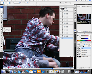
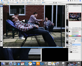 The main tools used throughout this project was the lasso tool, Cloning tool and the Blur tool, you can see this by the number of screen grabs that I have selected to place on this page. The most useful tool out of the entire selection was possibly the Cloning tool. This helped me alot with using photoshop. As I had never used photoshop befor I found it rather hard to get use to this brief but I felt overall that the images That I have produced are quite successful, the main task for me was to just get use to photoshop and try and produce something that interested me and that I was proud of.
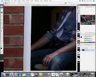
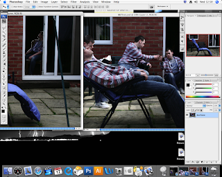
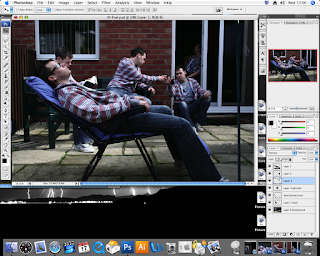
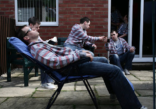 In my opinin this is the best image out of the three, mainly because I spent alot more time on this image trying to make it perfect, as I dont think I would change anything to it, however when in my last crit presenting the work, it was suggested that i caould of used the reflection in the glass to place in another image of myself, now that i think about it that would probably of been an interesting effect.
Breakfast Task
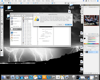
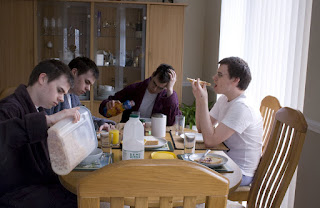 This was actually the first set of images that I worked on with photoshop. It became quite complicted when taking my images as you can see i have set up a table for breakfast and this became quite complicated when deciding what I needed to place where and what picture I need ed to place certain objects in, however the images turned out alot better then i thought. When using photoshop it started out quite well it was only toward the end that I began to pick up on certain points that I was not happy with. Unfortunatly as you can see above when I came to finishing off the last touches of my images there was a fault with the system and my images were coming out all pixelated with the different colours spread across the picture. Thankfully when coming to print off my images this problem had gone and I was able to print out as I wanted it, however I was not able to make any of the adjustment that I wanted, this was mainly to the outline of the hair and the brighness in one of the charcters of me. Overall in my opinon it did turn out rather well, much better than what I expected when starting this brief.
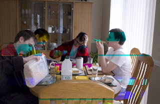
Initial Idea and One of Final three
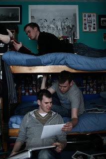
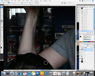 This was actually the last image that I produced it was also the last set of images taken, I felt that I needed a new set of images so I had more a variety of final images. When producing this image on photoshop, I only had one major problem, this was the outline of the hair as you can see here. I struggled to make it appear normal to the viewer and not suggest that photoshop had been used. I used the paintbrush tool as you can see here to try and create a shadow on the arm behind, I felt this would produce a more realistic piece however in my opinon it looked even more noticeable when using too much of this shadow affect, as it draws your eyes into this section, so in the end I limited this effect. I felt that this was quite a successful image as people seemed to find the fact I have placed the arm of the back character and placed it infront of the front character, to create this atmosphere of there actually being more than one of myself quite clever. As you can see below I simply went round the arm and the picture again useing one of the lasso tools and placed it in the correct position on the layers grid and this is how I managed to capture this effect.
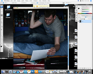
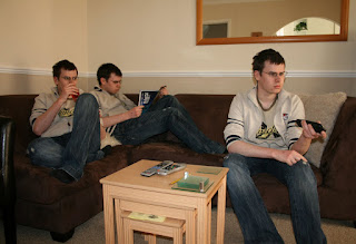
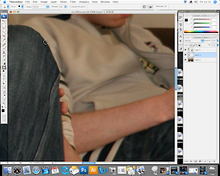 Using the blur tool I was able to make the parts of me that were to sharp for the image blured so it appeared much more realistic. This was a useful tool, that will come in handy when doing my final pieces, as it will make my images seem more real.
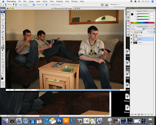
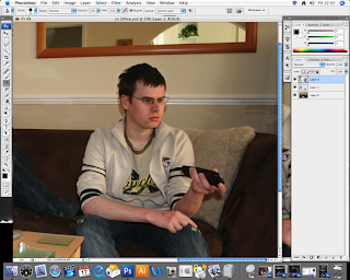
As you can see by this image I have used the cloning tool to change the back layer to make it blend in with the image of myself.


These are the first set of images that I had taken for this Final Idea, I practised with these set of images first, to get me use to the whole Photoshop software. I set up in an area of my house, and simply by using the timer, and keeping the zoom in the same position at all times, I was then able to take three images of myself to begin using Photoshop.

Research
Unfortunatly i could not find any artists that use this idea of multiples however it has been done quite alot befor, however I am wanting my images to show the number of people within them to react with each other, where as in many of these images i have seen there all a little bland, however this image by Gogoye in my opinonb is quite an interesting image and it works well as an overall picture.
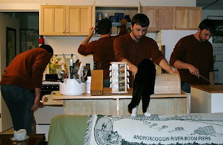
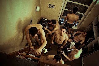 Gogoye


 Gogoye
Wednesday, 5 March 2008
Third Task
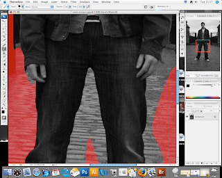
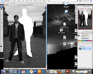
Using the Lasso tool I formed a quick outline around my entire body, then with the paint brush tool I was able to go around the parts of my body which could not be selected by just using the lasso tool, as this would not have produced an ideal and neat pattern around my body. When I had finished going round my whole outline I was able to select this section of the image, this way being able to place it in another image.
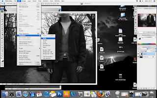
Scanning in an image of my own onto the computer I was able to drag the image of myself on top of this new image. Using the editing tool and the transform tool I was able to change the scale of the cut out image, of myself.
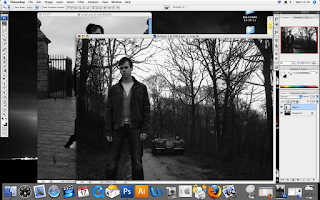
The first image below, which I produced with these tools I feel, does not give the intended affect that I was hoping to capture. I also feel that the scale of myself within the image is too large for the surroundings within the photo and makes me appear as a giant. I am going to try and play around some more with these tools to create a more interesting image.
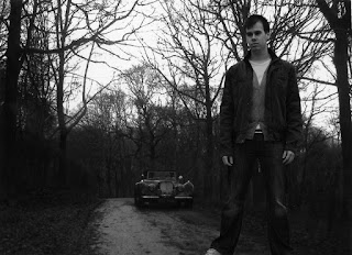
In this last image below, I repeated the cut out, to produce five images of myself on one picture. Mainly focusing on the scale so I wouldn’t look too out of place within the final piece as I did in the first image. I feel this has been quite a successful task as I have picked up a new skill. When doing the second section of this task I hope to create a much more realistic and better quality image.
Tuesday, 4 March 2008
Second Task
Firts Image from Task 2

The original image that I used was of Charlotte smoking, I decided to use this as my first idea, as for this project I wanted to create some kind of campaign either for smoking, drinking, obesity etc. So this way I was able to practise with this concept of producing a campaign. As for this second task we were asked to scan in some kind of object or text, so I used a cigarette packet which worked well with my topic, this also included text so it helped make the piece more significant. Once I had scanned the packet into the computer I was able to change the size of the object using the editing tool, I felt this would make the piece more alluring, instead of just one size throughout the picture, as this would make it quite tedious and simple. Once I had every packet covering the first photo, I began changing the opacity of each box one at a time, this crating a transparent affect, with each one being at different scales, some being at a high contrast and some at a low. Overall the opacity tool works well and is a useful tool to know. I will probably find a way of using this in my final project.

Second Image from Task 2

Using an image of my own, I began scanning different negatives onto the computer, similar to the first image from task two; I cut out the negatives using the accurate tools, and over layered them onto the image of myself. The negatives that I used are of people who I know, mainly family and friends; I felt this would make it more significant.


Once I had covered the background image up, I began using the opacity tool, to create a similar affect as the first image. The overall image I think works well, and I feel I have accomplished task two quite successfully.


The original image that I used was of Charlotte smoking, I decided to use this as my first idea, as for this project I wanted to create some kind of campaign either for smoking, drinking, obesity etc. So this way I was able to practise with this concept of producing a campaign. As for this second task we were asked to scan in some kind of object or text, so I used a cigarette packet which worked well with my topic, this also included text so it helped make the piece more significant. Once I had scanned the packet into the computer I was able to change the size of the object using the editing tool, I felt this would make the piece more alluring, instead of just one size throughout the picture, as this would make it quite tedious and simple. Once I had every packet covering the first photo, I began changing the opacity of each box one at a time, this crating a transparent affect, with each one being at different scales, some being at a high contrast and some at a low. Overall the opacity tool works well and is a useful tool to know. I will probably find a way of using this in my final project.

Second Image from Task 2

Using an image of my own, I began scanning different negatives onto the computer, similar to the first image from task two; I cut out the negatives using the accurate tools, and over layered them onto the image of myself. The negatives that I used are of people who I know, mainly family and friends; I felt this would make it more significant.


Once I had covered the background image up, I began using the opacity tool, to create a similar affect as the first image. The overall image I think works well, and I feel I have accomplished task two quite successfully.

Monday, 3 March 2008
Third Task

By bringing up the image of my own onto Photoshop, I was able to produce a knew layer, this allowing me to merge the image with the other two, simply by dragging the picture over the top of the main image. I then simply just change the opacity level to create this transparent affect, which I used in the previous task.


As you can see in this first image there is mixture of four images combined together in one image, however I felt this looked too over cramped and also made it confusing for the viewer to see what is what. So I removed one of the previous images, I felt this made the final piece quite a success.

Monday, 25 February 2008
First Task

I wanted to use something within this cropping task which related an anti smoking campaign, as this was something I was wanting to focus on in this brief. When this image is cropped all that the viewer can see is some form of a devil shaped figure, it is not clear what this image is meant to represent, however we can see it is produced with smoke, so we could asSume it may have something to do with smoking but it is not clear. However when viewing the full image there is a clear difference of meanings to what this image represents. I feel that this is a useful image for this task on changing the meaning.


When first viewing this cropped image it could possibly come across as being quite a seductive image, however when seeing the image in full it appears quite disturbing, as the tongue as formed into the tip of a lit cigarette. I do think it changes the meaning of the image quite well, so I felt it was a good quality picture to go onto the blog.


When I first cropped this image I was in doubts whether or not to place it on my blog as I felt it may not clearly change the meaning, however I decided that I would leave it and get peoples opinions on how they feel, and if the meaning has been changed or not. When first seeing the cropped image, we see a group of people standing around observing something; this could possibly be a parade or anything harmless. When viewing the full image it appears that a large wave (Tsunami) of water is coming straight towards the group. In my opinion it comes across as quite strange how people appear frozen and motionless. I think this is what helps the cropped image change its meaning.


An image being cropped can easily change the meaning and importance; this can be observed in an image which I consider to be ideal for this first task of cropping an image to connote a new meaning. As we can see below that the first impression of this image is a young woman snorting some form of drugs. It is uncertain to us at this moment that there could be any other meaning behind it.
The next photograph above shows the full meaning behind the image, and it is clear to the audience that there is a much less dramatic meaning behind it. It is part of an advertisement for Sisley fashion. The new meaning behind the image appears more amusing and sarcastic towards people who actual feel this craving for shopping. This is a clear contrast between each image.
Monday, 28 January 2008
Subscribe to:
Comments (Atom)


